
Twitter has adopted a redesigned bird as its new logo, bringing uniformity to the symbol representing its brand.
The new logo, which was announced Tuesday on Twitter's blog, replaces Twitter's lowercase "t" and the
old bird. The new bird resembles the older logo but appears to be slimmer and is also
tilted upward.
"From now on, this bird will be the universally
recognizable symbol of Twitter. (Twitter is the bird, the bird is
Twitter)," said Doug Bowman, the company's creative director.
"There’s no longer a need for text, bubbled typefaces, or a lowercase 't'
to represent Twitter."
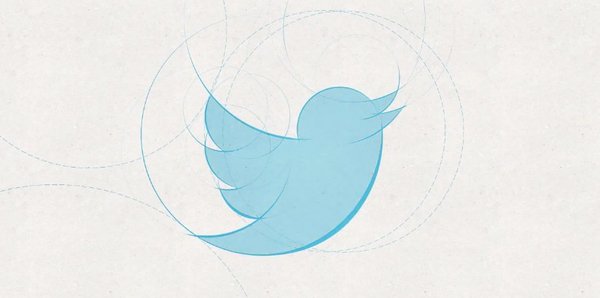
Twitter said the logo is created from three overlapping
circles (although I see more than three), and they are meant to represent users'
networks, interests and ideas connecting with others.
The bird itself is also symbolic.
"Whether soaring high above the Earth to take in a
broad view, or flocking with other birds to achieve a common purpose, a bird in
flight is the ultimate representation of freedom, hope and limitless
possibility," Bowman said.
See the difference in the logos:

0 comments:
Post a Comment